 |
| I'm a big boy now. |
Thursday, August 20, 2015
Job is a funny word. Job job job job job. Job job. Job.
I've got myself a full-time regular job now, which means this blog will take a back seat for awhile, at least until I get adjusted to the hours and figure out where my free time is. So that means posts will be sporadic. I doubt I'll be able to do once-a-week posts, at least until life clears up a bit. We'll see how things work out.

Thursday, August 13, 2015
FissureVerse - Four Cards get art
Thanks to Soup-plz,
Luis Angel "MetaShinryu"
Payano, and Joakim Olofsson
for the art! The artist list on the
sidebar is getting large and unwieldy, so I may have to find another place to put
it. I don't want to bury it very deeply,
so perhaps I'll make a new tab for credits or something.
 |
| Click for bigger! |
Vista of the Infinite and
Forsaken look pretty opposite. One has a
lone figure, relaxing, looking up into the sky; the other has a lone figure, on
guard, looking down into some terrible pit.
For Vista of the Infinite, I think I
shrank the flavor text a hair, but is otherwise unchanged. For Forsaken, I don't think I changed
anything at all. The art I used for
Forsaken could have been used for Trenches of Otherworldy Sorrow, and I debated
a bit with it. I think Trenches will be
harder ultimately to find a perfect match for, but this art really said
'Forsaken' to me.

In an effort to put more non-human entities on Crusader
cards, I picked these two pieces.
Creatures was always meant to be... creatures... and for Of the Sea, I'd
kinda played around with the idea of mermaids, but I like this better
(actually, look close, there is a
mermaid in it).
Neither card gets flavor text; Of the Sea has no room, and I
felt that the creature in Creatures was fairly dumbstruck. Cropped out of the picture was a woman or
girl, so it had a very similar idea behind it as the art for Of the Sea.
I switched the Reason and Water stats for Of The Sea, both
to keep in more in line with Blue's theme, and also, a water-based creature
should be best in water, eh?
Oh, hey! Emptiness cards are half-done!
Oh, hey! Emptiness cards are half-done!
Wednesday, August 5, 2015
FissureVerse - Nine cards get art, and a Location Diagram
Thanks to Alberto
Vangelista and Chibionpu for
letting me use their awesome art!
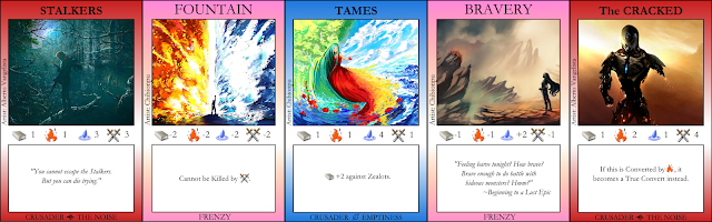

 |
| Click to make all big and stuff. |
Locations are filling out nicely.
A Child's Imagination removed the actual child itself from
the picture, so I decided to remove the mention of the child from the flavor
text, as well. I think this new flavor
text makes The Infinite more sinister, and less stupid. The art itself is of course very much what I
was going for, giving off vibes of Alice's Adventures in Wonderland and Mario
games (fun fact: Alice was where Miyamoto got the idea of mushrooms making
Mario get bigger! But I digress.)
The Crystalline
Tower was always a tough
one, because I had such an exact idea of what I wanted it to be, so I was never
satisfied with art that looked kind-of-sort-of like what I had in mind. But upon finding this art, I decided it would
be better than my original vision. It
pays to welcome the new! It looks more
solitary and haunting in this image, but the blue bands give a technological
feel. I shortened the flavor text in
hopes to reflect the new mood of the card.
Treetomb was similarly tough, because I had a hard time
straying too far from my original placeholder art, but when something new
works, it works. The knight in the
middle helps set it off as a haunted, lonely place. In this instance, I expanded the flavor text
instead of shortening it, partly because The Infinite is supposed to be a wordy
bunch, and partly because I was trying to capture something more than I
previously did. I do kind of think the
flavor text clashes with the art a bit, but I can always change the flavor text
when inspiration strikes.
With The Fishes, initially, was a flat, calm sea, while Path
of the Righteous was a roiling wave. I
like With The Fishes this way better, because I think The Noise would rather
dump a person in an ocean like this, rather than the mobster cement shoes
way. Even so, I kept the flavor text the
same, because that's just who they are.

The running theme here is "I changed my mind on what
the card should look like."
Stalkers was originally a person in a gas mask, and I
searched hard for a great image similar to the placeholder art, but I
ultimately picked this because I like how it doesn't show a Stalker, it shows a
victim. Look closely at the picture and you can see
the red dots of laser sights covering the guy; the Stalkers are outside the
picture, about to make a kill. With that
comes new flavor text in that spirit: brutal and demotivating.
Fountain was initially inspired by the Fountain of Youth,
though of course that's not quite what it means. By having a noun be the name of the Frenzy, I
arted myself into a corner, finding it hard to find something like a fountain that wasn't. Then I found this, and it works
excellently. I decided to go with no
flavor text, after trying a few things, because I think really explosive images
like this don't need any extra words; the art speaks for itself. There's triumph and power in the art, and
anything I tried to say distracted from the art. This art also works well because I know a lot
of the Frenzies are going to end up being dark cards, so having a bright one
like this helps to draw people to Frenzies a little more often.
Tames, similarly, needs no flavor text. I think the woman or nature spirit here
wouldn't say anything, she would just create and dance. I recall a sunrise or sunset symphony in the
book The Phantom Tollbooth, where an
orchestra played instruments, but all was silent, and they controlled the
colors of the sky instead. This gives
off a beautifully similar feel.
With Bravery, I had a lot of choices to make for the
artwork. Of course in this card, the
brave individual is the girl on the right, but I could have easily made this
Deceptive instead, and had the focus be on the creature on the left; or I could
have made this a card of Emptiness or The Noise, to boot. Many times when I have these kinds of
options, it comes down to the mechanics of the card and how well they are
represented in the art. Here, I think,
Bravery is represented best. The flavor
text was just me being goofy, using the opening to DragonStrike as a quote. Sometimes
you gotta break up the seriousness with a joke!
The Cracked was yet another I kept hemming and hawing about
with art. I kept wanting the term
"cracked" to mean "crazy", but ultimately I think a
broken-down robot fits quite well with the mechanics of this card, as
well. A robot isn't likely to be
converted by Fear, or could be reprogrammed to get back into the game if
captured. I chose no flavor text because
this guy to me looks like he's all bite and no bark.

Lastly, I add this picture to the instructions. I need to start putting in stuff like that
again, so I'll be adding more diagrams to the instructions soon enough, as well
as putting the examples back in.
Thursday, July 23, 2015
Flash Game Mini-Review: Hexad
Oh, god, the music! It's so catchy! It burns! It burrrns!
Hexad is a quick little puzzle game where you click on
groups of hexes to remove them from the screen.
If, in doing so, you separate the connected hexes into groups, the
smaller groups all disappear. The goal
is to make all the hexes disappear given a limited number of clicks. Some hexes can't be clicked on, so you have
to find a way to put those into a small group to make them disappear.
 |
| I don't know why, but this level killed me. |
Each level offers at least four ways to beat it, since you
can click on each of the four colors as your last move, and you get a mark for
completing the level and ending on that color.
My minor complaint about that is that in some levels you can win two
ways just by repeating your previous moves verbatim but switching the order of
the last two hexes you click on, so there's not always too much challenge in
discovering a completely new sequence of moves.
However, you also get more stars for beating a level under the maximum
number of moves (although I think you might also get three stars just by
beating a level with all four colors last).
It's a fun little minimalist game that has some challenging
replayability to each level (if beating a level once isn't challenging enough
for you), but the biggest draw for me is the music.
I don't know what that tune is, if I've heard it before or
what, but my god does it ever get stuck in your head. When you click off the game, the music
pauses, which is a blessing, because if it didn't, I'd be listening to it until
I went crazy. They must have tested this
game without that and sent half their tester to the nuthouse.
Now that I think about it, it sounds like the Super MarioLand music somewhere.
Do do do do, do do do do...
I take it back! You can do other stuff and listen at once!
I'm doing it now!
Wah doot doot, wah doot doot...
HELP!
Friday, July 17, 2015
[Error: no title]
It's been a pretty long haul getting lots of FissureVerse
stuff moving along. I basically spent
each week thinking "this will be the week where I can't get anything
done", but then I get great responses from artists and can post some art
(and make other adjustments to the cards and rules). This week I finally got nothing.
 |
| Notice there is no paper in the typewriter. That's metaphorical of something. |
Now I think I'm a little burnt out with FissureVerse, and of course I've been itching to get back
into Latchkey ever since I set it aside.
It always one of those things where you change your mind the moment
you've made a decision.
So this week I guess my post is just this update. The schedule for me is: next week I'll make
at least one post (if I still have no work on FissureVerse to report, I may do
a game review), but I'm off on an adventure the week after so no post for that
week.
When I get back, I may settle down and start cranking on
Latchkey again. I'm reconsidering a lot
of things I was doing (including making the interface less than six big
blocks), so the project may get restarted, which, on the whole, is probably a
good decision, so I can use proper programming practices from the get-go. I will likely also reconsider some mechanics. But I guess that remains to be seen.
Tuesday, July 7, 2015
FissureVerse - Symbols, Frenzy Bluff Attacks, and New Cards
First: six cards get new art! Thanks to Mariel, cubehero, and Saana Viinikka for the art! All of them are awesome people and awesome
artists!
 |
| Click to read the macabre! |
I'm so happy to be getting more art for Frenzies and The
Noise! Of all the different categories of cards, they've been lagging behind
the most, but all of these catch the darker, more brutal tone of these kinds of
cards.
For the flavor text of Coded, I considered writing
"Never give up, never surrender!" in binary or hex, but neither come
out looking interesting, so I decided a more Infinite-esque quip would do
better.
For Twister, it's got a bit of a similar theme to Solidity's
Turbulent, but I tried what I could to break it off from being identical. In lieu of flavor text, I decided to make the
special rules a little twistery.
I might have considered flavor text for The Cursed, but
trying to get the special rules text to be logical enough without being
awkwardly verbose was a challenge enough in itself. Besides, I think this guy looks sufficiently
dark and brooding to warrant a more silent card.
Typically when I find a great piece of art, I go down the
list and see what could be a potential match.
For the last piece of art above, I was hemming and hawing over a bunch of
different cards, like Brainwash or Corruption or Decomposing, but when my eye
glanced over Through the Mud (a card my eyes usually glance over, as I never expect to find art for it), the
name jumped out at me. I did not expect
to find such great art for Through the Mud so fast. It looks like he's draining her energy or
strength, which works in a wonderful way, taking the metaphoric visual of
dragging someone through the mud and making a more literal and macabre act out
of it.
I also like how I'm now tying cards together. I like to think that The Derelict live on
Grime, or possibly the Plains of Filth (maybe Sewerlife coexists with them),
but now I've gone a step further in cohesion to give flavor text from other
Crusaders. I had done it with Trail of
Emptiness (giving it a Song of the Walkers), and I hope to do it with more, as
I can find places for them.
 |
| Click for more macabre and sadness. |
Brim of Despair gets a nice revamp. I changed the flavor text to be more
disturbing, and in line with how Solidity acts.
They aren't the jokey type like The Noise is, so I removed the old mixed
up quote I had and replaced it with this new text. I think it works in that brutal, Stockholm
Syndrome way Solidity likes to operate.
Limbo Rock gets to keep its old flavor text, but I think
I've found just the right art to capture what I was getting at. I think of Limbo Rock as being something of a
holy site or pilgrimage site, but I always thought it would be tough to find
art that's just right. Luckily, like
Through the Mud, I found the art long before I expected.
If you haven't noticed on the cards, I've also added symbols
to them all. I wanted to make sure
colorblind players could distinguish factions and turn order, and I think I
found a good way to do it. I'll try my
best to refer to each faction by name, rather than color now.
The symbol of The Infinite is, most logically, an infinity
sign. The symbol for The Noise is a
heartbeat/pulse/sound wave. I think
those two work the best in terms of making a literal translation of their
names.
Of course, Solidity and Emptiness were tougher. What was I going to do to show Solidity? A
cube? So I went with something that shows their personality and place in the
cosmos: a spiky crown. They are the
rulers of the universe, the movers and shakers, and the King rules from his
throne on Capitalia, with the Bishop of Hatred whispering in his ear, his
legion of Thunderheads striking fear in the hearts of the people.
For Emptiness, the obvious thought is to have no symbol, but
of course that's just unsymmetrical. So
I went with a leaf or feather, because they are tribal, nature-type people.
You can see these symbols on the Location cards inside the
colored dots for turn order, and you can see them on the bottom of each
Crusader card. I used to have a tilde
there, and I still do for Rogations, but I figured that was a good space-saving
spot to put those symbols, so when you're counting up cards at the end you can
quickly spot the symbol on an outer edge.
Of course, once
again this only effects cards with art and cards that will get art (I am so bad
at organizing templates and such).
Lastly, a new change that affects the rules: you can now not
only Bluff Attack a Conditional Rogation, but you can also Bluff Attack a
Frenzy. I altered the way the rules work
a tad so you get a choice of rewards for doing so, and if the Opponent wasn't
bluffing, they get a few options to rectify the situation.
It's been a few posts since I actually linked
to the drive, so here it is.
I do want to make a change to the goal of the game, or at
least how points are potentially scored, since doing a bit of calculating leads
me to believe the factions are imbalanced.
I almost want to hold off on that though, until I get some playtests and
get a bit of a gauge on win ratios. A
heck of a lot of factors can go into this kind of thing.
Wednesday, July 1, 2015
FissureVerse - More on Rogations, because I'm nuts.
Let's start with the card art this time:
 |
| Click to see bigger! |
I decided to put this guy by OTKMan1995 on Echoes,
because... because! Echoes, despite
having great attributes, always felt like a weak card to me, perhaps because of
the name. But with this art, I feel like
it's now a must-have in Solidity's deck.
 |
| Click to embiggen! |
The art by TheMichaelMacRae for Battlefield looks like a
movie. The only change I made to the
flavor text was an exclamation point.
You'd think in the heat of battle, you'd be shouting, not growling, eh?
Anyways: quite a few changes to the rules. I've updated the language to keep vocabulary
correct, but I've also added rules so you can gain tokens from Rogations, and
you can now Bluff Conditional Rogations.
You can also call a Rogation's Bluff as a Crusade Action. (I made it a Crusade Action because it costs
Tokens to perform).
I'm sure I'm missing something in the rest of the rules,
too, especially since I had to add a whole bunch of rules and clarifications
which I thought were already in there.
I've also gone through and added the Faction label on all
Crusaders at the bottom of each card.
This will help colorblind people easily differentiate between
Factions. I'll have to fix Locations, as
well, so each colored dot somehow says something more. I'm thinking of the Faction letters within
the dots, like S for Solidity in Yellow... but I feel like that might look off. Oof--I just realized I need to make the
Special Color Text something else as well...
In the same spot as the Faction labels on Crusaders, I've
added the type of Rogation to each Rogation, so now there is absolutely no
guesswork as to whether a Rogation is Immediate, Lasting, or Conditional. It also looks better than bolding the first few words of each
Rogation.
Now I wonder if at some point I'll come up with different
styles of Frenzies...
Subscribe to:
Posts (Atom)