 |
| Click to make all big and stuff. |
Locations are filling out nicely.
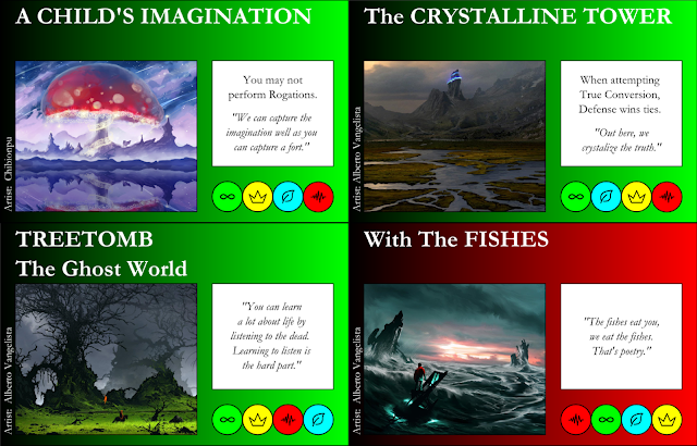
A Child's Imagination removed the actual child itself from
the picture, so I decided to remove the mention of the child from the flavor
text, as well. I think this new flavor
text makes The Infinite more sinister, and less stupid. The art itself is of course very much what I
was going for, giving off vibes of Alice's Adventures in Wonderland and Mario
games (fun fact: Alice was where Miyamoto got the idea of mushrooms making
Mario get bigger! But I digress.)
The Crystalline
Tower was always a tough
one, because I had such an exact idea of what I wanted it to be, so I was never
satisfied with art that looked kind-of-sort-of like what I had in mind. But upon finding this art, I decided it would
be better than my original vision. It
pays to welcome the new! It looks more
solitary and haunting in this image, but the blue bands give a technological
feel. I shortened the flavor text in
hopes to reflect the new mood of the card.
Treetomb was similarly tough, because I had a hard time
straying too far from my original placeholder art, but when something new
works, it works. The knight in the
middle helps set it off as a haunted, lonely place. In this instance, I expanded the flavor text
instead of shortening it, partly because The Infinite is supposed to be a wordy
bunch, and partly because I was trying to capture something more than I
previously did. I do kind of think the
flavor text clashes with the art a bit, but I can always change the flavor text
when inspiration strikes.
With The Fishes, initially, was a flat, calm sea, while Path
of the Righteous was a roiling wave. I
like With The Fishes this way better, because I think The Noise would rather
dump a person in an ocean like this, rather than the mobster cement shoes
way. Even so, I kept the flavor text the
same, because that's just who they are.
The running theme here is "I changed my mind on what
the card should look like."
Stalkers was originally a person in a gas mask, and I
searched hard for a great image similar to the placeholder art, but I
ultimately picked this because I like how it doesn't show a Stalker, it shows a
victim. Look closely at the picture and you can see
the red dots of laser sights covering the guy; the Stalkers are outside the
picture, about to make a kill. With that
comes new flavor text in that spirit: brutal and demotivating.
Fountain was initially inspired by the Fountain of Youth,
though of course that's not quite what it means. By having a noun be the name of the Frenzy, I
arted myself into a corner, finding it hard to find something like a fountain that wasn't. Then I found this, and it works
excellently. I decided to go with no
flavor text, after trying a few things, because I think really explosive images
like this don't need any extra words; the art speaks for itself. There's triumph and power in the art, and
anything I tried to say distracted from the art. This art also works well because I know a lot
of the Frenzies are going to end up being dark cards, so having a bright one
like this helps to draw people to Frenzies a little more often.
Tames, similarly, needs no flavor text. I think the woman or nature spirit here
wouldn't say anything, she would just create and dance. I recall a sunrise or sunset symphony in the
book The Phantom Tollbooth, where an
orchestra played instruments, but all was silent, and they controlled the
colors of the sky instead. This gives
off a beautifully similar feel.
With Bravery, I had a lot of choices to make for the
artwork. Of course in this card, the
brave individual is the girl on the right, but I could have easily made this
Deceptive instead, and had the focus be on the creature on the left; or I could
have made this a card of Emptiness or The Noise, to boot. Many times when I have these kinds of
options, it comes down to the mechanics of the card and how well they are
represented in the art. Here, I think,
Bravery is represented best. The flavor
text was just me being goofy, using the opening to DragonStrike as a quote. Sometimes
you gotta break up the seriousness with a joke!
The Cracked was yet another I kept hemming and hawing about
with art. I kept wanting the term
"cracked" to mean "crazy", but ultimately I think a
broken-down robot fits quite well with the mechanics of this card, as
well. A robot isn't likely to be
converted by Fear, or could be reprogrammed to get back into the game if
captured. I chose no flavor text because
this guy to me looks like he's all bite and no bark.
Lastly, I add this picture to the instructions. I need to start putting in stuff like that
again, so I'll be adding more diagrams to the instructions soon enough, as well
as putting the examples back in.


No comments:
Post a Comment