Thanks to Phill
Berry and game-icons.net for
the art!
FissureVerse gets a bit of an artistic
overhaul. Firstly, I switched up all the icons for consistency, and
to give proper credit for them (I'd never found appropriate
attribution for the old set of icons). They are all similar in
nature to the old icons, but I used the tools at game-icons.net
to customize them. Since I noticed before that the blue of Emptiness
Crusaders and Emptiness Locations were different, I used the palettes
for the icons to create a consistent color scheme. Location cards
also got extended art space and rules/flavor text space (shrinking
the location names a bit to achieve this). I also upped the
resolution from 200 to 300 dpi. I am sure this will increase the
file sizes, but I'll take that to make things nicer.
I have so far blitzed through the
Location and Solidity cards with new layouts, so I could add this new
art:
 |
| Clicky clicky to see the details...y. |
Grime is the home of The Derelict, and
being that I've had a bit of affection for the group, I've always
been hesitant to find good art for the card. Originally Grime was
meant to be a sort of slums, where Solidity keeps them down. The
background to the location is perhaps still similar, but with the
fortress-style art here and all the turrets, I think it shows that
Solidity keeps The Derelict in line with an iron fist, and rules over
them in a more direct way, rather than the subtle scheming way of the
previous iteration. Still, the new flavor text helps to push it
closer to the original direction.
The other three cards are old cards, just updated with some new flavor text and fixed colors and icons.
You notice, of course, the new
faction symbols (similar enough to the old ones), and the new attack
symbol in the extra rules. That brings us to regular cards:
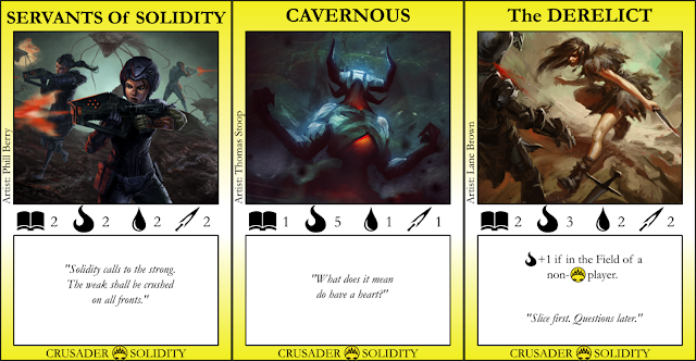
Servants of Solidity gets a refresh in
art and flavor text, to keep the theme more sci-fi and make Solidity
a little less comical.
Again, the extras here are for new flavor text, and The Derelict in particular is to show how the Solidity symbol looks when stuck in the special text.
The rest of the cards will be updated
slowly, probably as I get some new art for each card type. Until
then, there may be a mismatch in the style of each card type with the
new vs. old layouts (as well as the cards which I haven't gotten art for yet, like the remaining Solidity and Location cards).
Edit 3/6/17: The Solidity cards were accidentally exported as 200 DPI; they have been reexported as 300 DPI to match the Location cards.
Edit 3/6/17: The Solidity cards were accidentally exported as 200 DPI; they have been reexported as 300 DPI to match the Location cards.

No comments:
Post a Comment