Wednesday, November 1, 2017

FissureVerse: four cards, two with new art

Thanks to Dario Marzadori for the new art! You can check out his art on Facebook, ArtStation, DeviantArt, and Instagram.

War Machine & Plains of Filth
Click to see bigger.
Now War Machines is more of a location than a ship (perhaps a place where obsolete technology has been tossed), so that little quirk of the card has been fixed. Using this art, I came up with different flavor text, but combine it with the turn order (red going directly after green), shows that green thinks a little too much of their strategy.

I always forget Plains of Filth is a Red location, because Grime is a Yellow location and they are similar in my head. However, I think I like the idea that with this card, Earth, and Bottom of the Universe, Red is more the underground ruler, like the mob bosses and the slumlords. Solidity might take hold of the government, and they might drag populations down like Earthlings and The Derelict, but Earth and Plains of Filth (where I've decided The Derelict are likely from, not Grime), become the property of Red by virtue of Solidity dragging their populations down too far. It's a neat story dynamic, I think. Yellow focuses on Blue as its arch-enemy, paying little heed to Red or Green, letting Red take hold of the downtrodden, and Green take hold of the elites. The flavor text is a bit on the nose in describing that dynamic here, and I may change it, but perhaps Red doesn't care about letting it be known, because Yellow has their eyes elsewhere, and Red can hide in plain sight (no pun intended).


At first I was a little bummed that the head of the statue would get cut off by the name “Paradise, the Ice World.” Then I came up with the brilliant idea of mirroring the image (sorry Gij for the modification) and... it still didn't work. Then I realized: “Why have 'The Ice World' at all? Seems obvious by the picture...” And now, it works! I also changed the flavor text to get away from the originally concept as a fake vacation destination. Now it's more of a pilgrimage for Green.

I decided to change the subtitle of Eclipse from The Infectious Nebula to The Blinding Nebula, since it's lost its special rules. I had loved the original name but it never quite went for a Green location. This makes things a little more in tune. Not 100% happy with it, but 100% better than it was.

Thursday, October 12, 2017

FissureVerse: 6 cards, 4 with new art!

First, thanks to Irbisty for the new art!

Sewerlife & The Awoken
Click to see bigger versions!
I couldn't come up with a short and pithy piece of flavor text to explain the concept of Sewerlife, so I opted to not put anything at all. I think this is the kind of card that seems all negative on the surface, but can be part of an interesting strategy, where you might intentionally lower your Endurance stat so that you'll never be converted by Torment, but rather Killed more often as a result, causing Locations to be flipped, and causing people to fear trying to convert you by Torment.

I decided to flip the colors of The Awoken and Dreamers for thematic reasons (also working right because Dreamscape is a Blue Location), but for now, the attributes remain the same. I like to think that The Infinite would be against Frenzies on philosophical principle—though, surely, a player can't win without using a few. But the attributes are good enough on this card that it's great for defense almost no matter what.

Dustchildren & Medical Frigate

I considered some pun for flavor text for Dustchildren, something about sweeping out the dust, but I think the card is meant to be more serious than that, and I didn't want to ruin the mood of it. So instead, the special rules are all you get for it, which display that theme without being too obvious. I might revisit the card later and add some flavor text, but sometimes I like the stony silence and the glare of the characters in the art.

Medical Frigate is one of those cards where thematically it makes sense that if the opponent crusader would be killed, it isn't, since the Medical Frigate saves the life of the opponent Crusader in return for conversion. Given this, I think I may change other cards like Nomads so it reads “When this is Killed...”

Strangest Places & Yellow Fields

I believe the tall character in the art for Strangest Places is the central figure in the art for Dustchildren, so when I have a theme like that, I try to make the art flow right and be of the same faction. Here, however, Dustchildren is a Blue card, and Strangest Places is a Red card, so I thought perhaps I might have a quote from an opposing faction ob Strangest Places. I don't think it's necessary to make the quote by the Dustchildren themselves, just another Blue Crusader. I considered Servants of Emptiness or other simple cards (which typically represent Blue well), but I went with an attribution of Naomi, who is perhaps thematically a leader. She might be the smaller figure in the art, so it works well enough. For a further attribution, I called it a Eulogy, as though instead of verses or idioms (or quatrains) Naomi's advice always comes in the form of mourning (as does all Blue, likely).

Monday, September 25, 2017

FissureVerse: 6 cards, 3 with new art!

First, thanks to Evgeniy Chugonov for the new art!

Flag & Deceptive
Click to see the new art... but bigger!
I always knew the term 'Flag' would be symbolic, not literal in the art. I think this works pretty well, because on its surface it looks like a beautiful image of a totem-worshipper, but looking close, you can see the bloodstain. I also chose this art for a Frenzy because I don't want Frenzies to get too dark in theme, so a Blue player, for instance, would not be too turned off by violent imagery. This one strike s a great balance. The flavor text is also fairly neutral; my first through for flavor text struck a darker tone, so I made sure to write something that was at least a little closer to the art.

For Deceptive, I got to invoke one of my favorite fairy tales, with a FissureVerse spin. Kinda pushes FissureVerse into new territory. We'll see if that idea extends or if this is a one-off.

The Collector & Android 4

My original idea for The Collector was of a shopkeeper who collected souls, or something to that effect. When I got permission to use this art, I originally considered other places for it, but ultimately I think this gives a much needed spin on this card. I also considered changing the name to Collectors, because there's multiple fliers in this art, but I also like the idea that they are a collective that considers themselves one unit. Kinda thematic. Okay, I'm stretching.

I decided to move the art from The Cracked to Android 4; Green is a tech-oriented faction so they'd be more likely to use an old busted robot. It just didn't feel right as a Red piece; certainly, Red is clever, but I don't think they'd take the time to reprogram an android for any purpose. I also made new flavor text to go with the new use.

Unkempt & Stalkers

Unkempt gets its -1 Attack stat changed to +0 to keep it in line with similar cards, like Love Potion and Coded. I also changed the flavor text ever-so-slightly to mean the opposite of what it used to...

Like Android 4 and The Cracked, I decided to move Irregularity's art to Stalkers. It fits better there; now I'm back to the tough one of finding art for the stranger name... But for Stalkers, I also shrank the flavor text. I think that perhaps since The Noise is so swift in speech (I imagine that's their public persona since they ought to be boisterous in their own crowds), they would condense common idioms to even shorter sound bites.

Man, looking at all these cards together makes me see just how outlandish and scatterbrained it all is... maybe I should've kept my old blog name after all...

Monday, September 18, 2017

FissureVerse: 6 cards

Six more cards get updated:

Holiday & Hiding
Click.
Since Holiday loses its rules text, I changed the flavor text to have less to do with it. Now it ties in more with the propaganda aspect of Solidity and less with backroom deals. What is funny, of course, is that their archenemy, Emptiness, goes second in turn order on this card, and they are the real peacemakers, if any faction can say that about themselves.

Since Locations just don't look right when there's no flavor text at all, I put off Hiding for a long time until I could come up with something. I almost wanted to quote an OK Go song...

Flesh & Shortened

I gave Flesh some flavor text to suggest that The Infinite knows that they can't be all brains. I still love how a card named “Flesh” has skeletons for art. This is the sort of card that either a Player will love and make it part of their strategy, or hate and never put it in their deck. And a player that is not Green wouldn't even have a clue how to use it right, since there is nothing like it in non-Green decks, so if they successfully converted by Reason it might become a liability.

Shortened is tough on the art, because the original image is so tall; it makes me struggle to decide where to shift the perspective, since something is always lost. This time I elected to push the image to show the bottom, so the character looks more cramped.

The Cursed & Tames

The Cursed gets completely redone, and, like Hiding, I put it off for a while because it's so tough to change. I really wanted the idea of a cursed card, but the previous special rules (the opponent gets to make a decision) were just broken, and no matter how impressive the card was in attributes, no one would ever play with it. So I gave a different spin on what 'cursed' would suggest (although it is perhaps similar to some Yellow cards like Hitchhiker), and to balance it out lowered both its Torment and Attack stats by one each.

Like similar cards, I modified Tames to make payment even. Instead of 1 Reason and +2 against Zealots, it becomes 2 Reason, -1 against Devotees, +1 against Zealots. Unfortunately I think it loses a little of the beautiful simplicity of the old text, which I think is needed on a card like this, but you gotta do what you gotta do for balance.

Monday, September 11, 2017

FissureVerse: 6 more cards, including two new pieces of art!

Firstly, two cards get brand new art! Thanks to Benjamin Wiesemann for the new art! Let's get to those first:

Servants of Emptiness & Guardians
Click to admire the new art!
Servants of Emptiness was a little tough to get the flavor text just right. It needed to be somewhat pithy, but not terse like The Noise, but not overly verbose like The Infinite. It also needed to encapsulate the rebelliousness and independence of the faction, without necessarily being completely depressing and hopeless like a few of Emptiness' other cards are. I also like how the art suggests, more than other Servants cards so far, the even nature of the attributes. She's got a book in her hand, a sword on her back, and fire in her eyes.

I like how the Guardians art is similar: a book, a weapon; but lacking the fire in the eyes and having a softer look instead, which works great because the lessened Fire stat.

Decomposing & Psalms


Psalms is a little tricky. I've gone back through a friend's notes who read the instructions and looked at the cards some time ago, and he said it seemed like too many cards were direct negations of player actions, such as how Psalms simply blocks another player's successful Crusade. I will have to rethink how such cards work. This is particularly troublesome since Psalms can be played almost any time (Spiker range 0-6). Naturally testing will figure out if it's too mean—which is funny, since Psalms should be the opposite of mean.

Optomites & Witch Doctor

Witch Doctor has been modified to include one additional word: “if”. This completely changes the card, so now, it's no longer that Zealot Frenzies are negated against Witch Doctor, but rather only if the Frenzy is revealed on that Crusade does the Frenzy have no effect. This diminishes Witch Doctor's bonus considerably, so to compensate I raised the Book attribute from 1 to 2. I figure maybe a Witch Doctor might be a little more learned than before.

Wednesday, September 6, 2017

FissureVerse: 7 more cards, and the other back

Seven more cards, plus the back for cards in the players' decks.

Nightcaps & Academic
Click, or something.
On the one hand, I question the usefulness of a card like Nightcaps. On the other hand, I don't want everything to be average and homogeneous. Maybe a clever player will find a great use for it. When a Frenzy is applied to any card, I should think, the stats are always up in the air.

Speaking of Frenzies, I'm considering adding some sort of “spy” mechanic so a player can reveal the Frenzy of another player without Crusading and risking anything. Maybe.

Academic gets its Endurance stat changed from -1 to +0 for consistency with similar cards.

Aetherworld & Haven

Aetherworld is another Location where the simple special rules (Crusaders gets +1 Endurance) would do well elsewhere, so I'll consider where else I can put it (though likely not a Spiker).

Player Back& Burial Rites

Promised I would get to player deck backs. Similar to Location Backs, but of course without the icon, rotated, and with different art (same artist). I also decided to add my name to the back of the card, as well as the Location card backs (because vanity).

Burial Rites gets a major overhaul. Firstly, I changed it so you can play it when any Crusader is killed, not just your own, so it's easier to play. The old text used to say that players can't Frenzy “Until the end of the Round, or your next Turn, whichever comes last.” Well, the Round would now end immediately, since a Location card gets flipped only when a Crusader is killed, and it's possible that the player who plays Burial Rites might be first in Turn Order on the next card, so it accomplishes nothing. Now, it affects the entire next Round. I also mentioned that you play it after a Crusader is killed but before a Location card is flipped, because if you were to hand on to it til after the Location card is revealed, it might not be a Rogation at all, but a Spiker, and if it's the fifth Spiker, you wouldn't be able to play it at all. Lastly, I made it a Spiker requirement of 0-4, to say that there's no time for Burial Rites the further down the Spiker hole we go.

Abyss of Emptiness & Carnival

Carnival simply gets its flavor text changed, so it's more devious, less flippant. But as I work out the nature of Spikers, I'm considering making a few current Locations into Spikers, and replacing the locations with some other ideas.

Thursday, August 31, 2017

FissureVerse: 6 more cards

Six more cards get the new layout!

Tearmen and Rally
Click please.
I increased Tearmen's Sword stat to 3, an changed the special text from “(Sword)+2 as Defense” to
“(Sword)-1 as Offense. (Sword)+2 as Defense.” I did that with previous cards as well, which mathematically comes out the same, but with the tokens, it costs more for the player.

Rally becomes very different, because I'm now using Spikers as a major mechanic. Originally you pick up three cards always, but now that it's dependent on Spikers, you'll pick up more as the game goes on. The interesting thing, I wonder, is if that clogs your hand with Crusaders late game when you can't really afford a clogged hand, especially a hand full of Converts you really don't know how to play with (and that might be too weak in Endurance for you).

Nomads and Miracle

Similar to Vermin and The Expired in the last post, Nomads gets a “would be” instead of “is.” However, I am still strongly considering fixing that back, so that a Location Card still gets flipped when it's Killed.

I gave Miracle a Spiker requirement of 2-6, to suggest that Miracles aren't possible in the 'normal' universe, but become possible only once the fabric of spacetime breaks and allows miracles to pass through. But there comes a point when there's too much, and the universe can no longer sustain a Miracle.


The art for Red Skies is too wide for the card, like Excursion is. Unfortunately a very interesting detail gets lost, but I wonder if maybe in the future I can use the other half for another card, to make a fun little Easter egg for the observant.

Tuesday, August 29, 2017

FissureVerse: 8 more cards

Yet eight more cards to post. I seem to go through them quick enough to warrant a lot of posts in quick succession.

Vermin and Bravery
Click and stuff.
I changed Bravery's Attack stat from -1 to +0, both because it fits with the theme and because it evens out the card. Other cards in this line will get similar treatment.


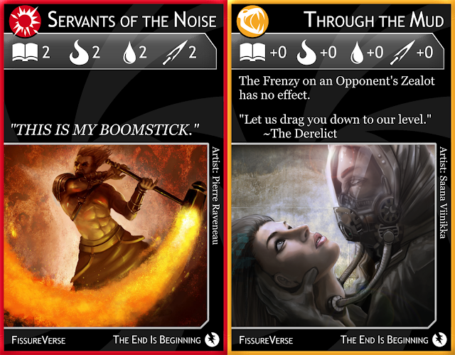
Servants of the Noise and Through the Mud

I always flip flop on the flavor text of Servants of the Noise. I considered adding “THERE ARE MANY LIKE IT BUT THIS ONE IS MINE,” but that would be overkill, and The Noise don't really know how to form sentences that long.

I'm debating about whether to make a change to the stats bar of Through the Mud, like adding +1 Torment. Unfortunately I think that, although it would thematically work, it would make it far too powerful. I should instead give it negative attributes, but I think all that would overly complicate the card, especially with such a big special rule.

Servants of Solidity and The Expired

The Expired gets its wording slightly changed from “If this is Killed” to “If this would be Killed”, because that keeps a Location from triggering. I may change it back.

Treetomb and The Crystalline Tower

Crystalline Tower loses its special text, of course. I think Defense winning ties when Crusading by Reason might make a good mechanic somewhere else, so I'll have to keep it in mind. Probably not a Spiker, however.

Monday, August 28, 2017

FissureVerse: 13 cards and a back

On my last post, I forgot to give Lifters and Lugubrious the Crusade Icon. Fixed now in the Google drive.

Mirage, the Desert Temple and Grime
Clicky clicky.
I decided that the artwork of Mirage, the Desert Castle looked more like a church or a temple, so I opted to rename the card. Goes more with the religious theme of the game, than of a medieval fantasy.

Seedling & Sermon

Seedling (and Starving previously) get their special rules text updated to be more clear. Seedling sounds grammatically correct, but Starving never seems quite right.

Sermon gets a lot of its wording changed, considering it is no longer a Conditional Rogation. It loses a little bit of its theme by removing the whole “place in the Field” aspect, but that's okay enough, I suppose. The tricky bit was to word it in such a way as to take up as little room as possible, so I could keep the flavor text. I think they kind of run into each other a little bit, but hopefully the split is noticeable to the eye.

Location card back and Cremation, the Deadworld

I'm not just fixing the fronts of cards, of course, but the backs as well. I've decided to make the Location Card backing similar to the front in terms of the title bar and border. I keep the Location icon so there's no chance of confusion whatsoever. I think I'll probably do something similar (just rotated) for player deck cards (though I don't know what icon I could give them, apart from the 'cracked disc' icon, though I don't like that idea).

Cave of the Weeping and A Child's Imagination

I keep forgetting A Child's Imagination is a Green card. Makes them rather devious, I think, and only sounds out of character if you're not paying attention.

The Derelict and Respectators

I updated the text of The Derelict to match Earthlings (and also changed Earthlings to match The Derelict). Still unsure about these, but at least for The Derelict, there's the bonus of being not pathetic in Endurance.

Similar to how Lifters is great as a Red card, I think Respectators is great a a Blue card. A Blue player might want Respectators in their deck and protect it at all costs, so they have a fighting chance at conversion by Torment.

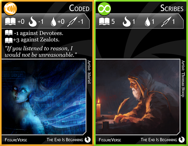
Coded & Scribes

I changed Coded's Endurance stat from -1 to +0. On a pure numbers standpoint, it evens out the stats and perhaps makes such Frenzies more likely to be used, but also I felt that thematically it worked better. Similar Frenzies will probably get a similar change.

For a card like Scribes, with no special rules, I wonder about the blank space. On the one hand, he's diligently writing in silence. On the other hand, that blank space is very conspicuous. I'm considering a “Shh...” as the flavor text, just to put something there. But then, I'd have to do that for lots of other cards I intentionally leave blank.

Whispers and Love Potion

I gave Whispers a Spiker requirement of 0-6, suggesting it's a possible action in all but the most dire circumstances, when the universe is reaching its conclusion and Reinforcements cannot arrive in time.

Just like Coded, I modified Love Potion's stats to be more even, in this case changing Torment from -1 to +0.

Sunday, August 27, 2017

FissureVerse: 14 more refreshed cards!

On a roll now...

I won't talk about every card, just ones that got more than a simple refresh or I have a concern about. The rest I'll just post here so you can see how the new version looks without comment.

Hitchhiker and Lugubrious
Click to view the cards in this post like a slideshow!
Lugubrious may be a bit tricky. I wonder how useful it would be, and perhaps it needs an extra Endurance to bring it up to snuff.

The Signpost and Bottom of the Universe

I removed the special rules from both of these Locations. Spikers for special rules are definitely the way to go. However, removing the special text from Bottom of the Universe left a bit of a problem, since there was no flavor text on it to begin with. I tried lowering the black bar on the bottom, but it didn't look right being too far down, so I opted for some flavor text instead. My original idea for Bottom of the Universe was a bar similar to the Mos Eisley cantina, but once I got this art for it, I decided to expand on that and suggest a city or perhaps a whole planet called the Bottom of the Universe. In this regard, it might be something like Grime or Plains of Filth. So I think the flavor text here helps bring that idea a little closer.

Mystics and The Unimaginable

I never noticed the flying fish of the background of the art of Mystics before! It seems to be a recurring theme with this game...

Excursion and Vista of the Infinite

The artwork for Excursion is such a beautiful wide panorama that even with all the room on the new layout, there still wasn't enough room to show the whole thing. I came up with a longer bit of flavor text just so the ratio of width to height on the area of the picture would be closer to the ratio of the art, and there's still so much I cut off of it. Well, at least it's far better than the original layout, where I could barely fit anything.

Rapture and Wanderlust

I gave Rapture the same Spiker requirement as Pestilence, since it's the same thing, but for Zealots instead of Devotees.

Slowpokes and Servants of the Infinite

For Slowpokes, I removed the part in the special rules about how you can't Frenzy it or Crusade with it. I think not being able to Reinforce with it is enough of a problem. Adding not being able to Frenzy or Crusade would just make it near impossible to play, in that no Player would ever choose it for their deck. This gives it a fighting chance to act as bit of a shield.

I messed up in a previous post when I said the title text could support “Servants of the Infinite” comfortably. Oh well, I hope the shrinking of the text here isn't too noticeable.

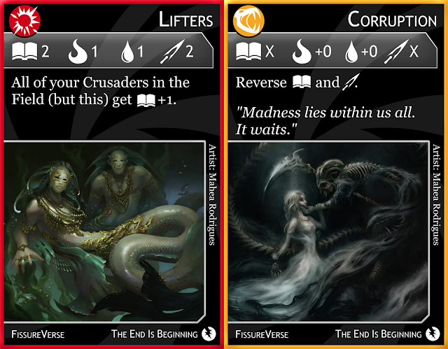
Lifters and Corruption

I really like that Lifters is a Red card. This card would be most useful as a Red card, and I bet any Red player would love to have this in their deck and protect it at all costs. Though, perhaps it might make Red cards become a target for conversion by Green now, rather than Red being to dumb to be converted...

Saturday, August 26, 2017

FissureVerse: 8 More Refreshed Cards

Yet eight more refreshed cards! The train keeps on rollin'...

Twister and Starving
Click to see bigger if you wanna.
Twister loses the funny way I put the text in the previous version (looking like a twister itself), but it gains clarity in the picture, and now you can see a lot better that there's two little people huddled by the twister! Also, I reduced the Endurance stat on it by one. I think of the rules text as a good thing for Red and a bad thing for his opponent, although there are particular circumstances where it would be beneficial for the Opponent to discard a card. In any case, the total of an average card with no flavor text is eight (Servants, for instance), so I usually lower the stats on a Crusader with a good bonus. This probably won't hold true forever, especially with some rules being subjective in how good they are, and not all the stats are quite created equal in the first place (you'd want to avoid Killing when you can, and be very careful when Tormenting).

Originally special rules text that made you pay attention in odd instances had the text color altered, so since Starving requires players to play attention when Enlisting, the text color was green. The text color might not be noticeable to color-blind players, it looked ugly, and green is a faction color, so there was plenty to be confused about. I didn't want to have a keyword like Magic: The Gathering does for common rules, so I've instead opted for a new icon. The icon on Starving in the rules text shows a card being drawn off a deck, which is precisely what Enlistment is, so it works. Hopefully the icon is large enough to catch a player's attention, but playtesting will see to that.

With the Fishes and Path of the Righteous

With the Fishes and Path of the Righteous get simple refreshes. Nothing to report except that I'm happy Location card art gets so much more room to shine.

Prophet of Prophets and Earthlings

Similarly, Prophet of Prophets gets a new icon for when to pay attention to it. Originally red text meant to pay attention during a Crusade, so now I've made that a winged sword. Crusades, like Rogations, are kind of difficult to come up with an icon for, so hopefully that makes sense. I also upped the Endurance stat of Prophet of Prophets by one. I think it's important to give the card a hair of longevity if you're going to try to play it, so giving it a chance to survive a round is important, at least long enough for a Frenzy to get stuck on it.

Earthlings was quite difficult to get the text just right (and I don't think it is; it's pretty clumsy, much like this sentence). I opted to remove the Solidity icon from the special rules and just put the word 'Solidity' instead. This card is also particularly tough to balance. A card that becomes more powerful in another player's Field is a tricky card to even desire to play, but I kind of think I want that to be a theme of Yellow, in fact that already is the theme of Yellow on other cards. Crusaders actively flee Yellow, and thematically, and in a story sense, that's pretty neat. But we'll see how playability factors into things.

Dichotomous and Cavernous

Dichotomous and Cavernous get simple refreshes. I feel like Dichotomous is particularly powerful, and Cavernous is particularly weak, but I guess it all depends on the Frenzy that gets used with it. I can't wait to playtest this stuff.

Thursday, August 24, 2017

FissureVerse: 8 More Refreshed Cards

Eight more cards get a refresh!

Abductors and Fountain
Click to embiggen if you wanna.
Abductors gets a simple refresh. A basic, even card that likely comes out more powerful than it appears on the surface because the two powerful stats are the ones that hurt the most, and the weaker stats are the ones players (now) aim to avoid going against, since they might accidentally kill Abductors and flip a Location (bringing doom nearer).

Fountain gets its wording changed to be similar to that of Steel, and its stats get altered as well. On the surface it looks like Fountain is purely better than Steel, but I think that won't necessarily be the case, since they have different uses, and one of the big tricks of Frenzies is to make Crusaders underperform, which can cause all sorts of interesting tricks.

I should point out here, perhaps, that I make sure to put extra rules texts close to the stats bar, while I put flavor text close to the picture, whether there is both present or not. I hope it works stylistically. One reason I do this is because I want players to be able to cover card art if they want to with a Frenzy without hiding important information, but they can cover flavor text so they don't keep reading it when other stuff matters.

The Noisemaker and Of the Sea

The Noisemaker remains exactly as before. I considered the idea that this being a ship, it might do to have it be more powerful than your average crusader (particularly on the Killing front), but I also always like the 1-2-3-4-ness of it, so I'll leave it as-is for now and see how it plays. It might need something to boost it, since not being able to hide its Frenzy is (what I think is) such a drawback.

Of the Sea has had its text reworded to shrink it, which was nice because I could add a line of flavor text.

Wedding and Hysteria

Wedding also has simplified text, and I put the caveat of required Crusaders first, just like I would for any other strange requirement. I am figuring out the required number of Spikers for each Rogation, and I want it to be both thematically and mechanically relevant. Pestilence, for instance (which I changed from 4-8 to 4-7, because the eighth Spiker ends the game), is a powerful card, so it should go later, but thematically it is also a godly act, while Wedding is a human act, and it's more of a way to allow Players to not get swamped by Crusades, so this would be especially useful early game.

Hysteria gets a simple refresh with no significant changes. I think the new card layouts flatter the art a lot more, and this one I think looks especially good.


Locations have a slight alteration: like the title bar, the bottom black area made for flavor text is editable, in that it can be moved slightly up or down to accommodate more text or more picture. This fixed an issue on previous cards with a bit of empty space, and gave room for me to fit the Trail of Emptiness flavor text in three lines without needing to shrink it, rendering the text nearly unreadable.

I have also decided, for now, to eliminate special rules on Location cards. This is definitely necessary for Locations where Players could get stuck there, like Holiday, given that a Crusader needs to die to flip the Location. Some cards like Forsaken, which simply gave all Crusaders +1 Torment, were fairly harmless as far as consequences go, so perhaps in the future I might apply that kind of special rule back. I'm thinking Spikers' special rules (if they have any) will likely be more devastating, though it might be fun to have little things like Forsaken's old rules apply, as well. We'll see.

Tuesday, August 22, 2017

FissureVerse: New layouts, icons, and art – redux, with rules and mechanics

My two main inspirations for FissureVerse have been Dominion, a game I was until recently obsessed with, and Magic: The Gathering, a game which I have not played in years, but have nostalgia for. But both of these games have similar card layouts, and my original designs for Crusaders, Frenzies, and Rogations was based on those two card games, with Locations being practically no more than a sideways version.

I felt rather 'meh' about my layout designs after a while, and knew they were bland, and graphically-challenged, considering I am no graphic designer. So now I'm taking another stab at the card layouts, trying to care about both form and function, eliminating clutter, and leaving as much room for art as possible.
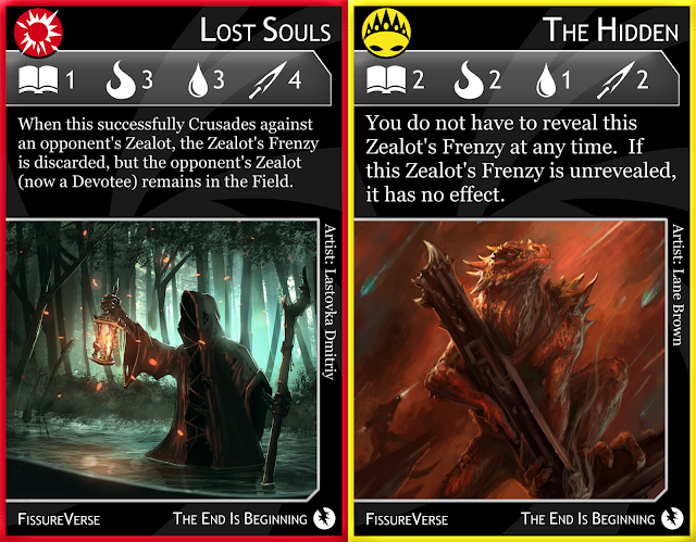
Lost Souls and The Hidden
Click to see all the new awesomesauce.
Firstly, cards are now primarily black (with a 'vortex' icon faded in the background), to give a better impression of space, with only a border showing the color of the faction. The faction icon is now big and bold, lifted from the bottom-center to the top-left. The card title is right-aligned, and enlarged to make it more obvious. (It's still small enough to fit "Servants of the Infinite" perfectly, which I believe is my longest card name.) Title text (as well as the text at the bottom of the card, and stat text) is a sans-serif font, to give a more spacey vibe, while the special rules and flavor text (and artist name) are a serif font for readability.

The stats have been pushed far up, since I think they're more important than being pushed down to the middle of the card. They're also highlighted with a grey bar to also help catch your attention.

The special rules and flavor text have been lifted above the art to be directly under the stats bar, so the eye can go straight from one to another without a jump. The special rules and flavor text also have variable font size to take up more space so there's not so much emptiness above. There are certainly some unavoidable instances of empty space, but it should be less noticeable.

Dripping and Numerologist

Also, considering the (somewhat) recent mechanic of paying Tokens equal to the number you're Crusading with, I've had to redesign some cards to be more Token-friendly. Dripping and Numerologist, for instance, have a similar mechanic, but they fix things so you aren't over-paying and the card balances out. You only pay the amount stated in the stats bar, not the special rules text, so you'll pay 3 if Crusading by Reason with the Numerologist, regardless of whether you're against a Devotee or Zealot. Makes the math easier, too.

The art has been moved down from near the top, yet it is far more prominent than it was before, due to the art being far larger now. By minimizing the borders I was able to embiggen the art.

Finally, at the bottom, I removed the card type and faction name (since both are redundant due to the faction/card type icon that's now at the top), but because I had a bit of room, I added the name of the game, and a subtitle with an icon ("The End Is Beginning", with a 'cracked disc'). I know I want a bunch of expansions for this game, so I struggled a lot with a subtitle and icon to the original vanilla set (if I even wanted either of those at all). I considered actually putting "Vanilla" and having an ice cream cone as the icon, but I figured I would wait on the humor for future expansions and not ruin the mood I'm going for yet.

Earth and Denial

Locations have got a massive revamp as well, giving tons of space for the art, and looking rather shiny and providing more information all at once.

Like with Crusaders, the top left has an icon, and this one being a black-and-white vista as the Location icon. The Turn Order icons flow down from the top like a totem. Kept in the top left is also the title, but it's surrounded by a bar that can shift its size to the size of the title (once again, perfectly sized for the longest title, "Trenches of Otherworldly Sorrows").

The art is now so large I can see details I never knew before, like the little girl in Blue Blazes! (See below.) However, unlike with normal cards, where the art is simply enlarged, the aspect ratio of this art has significantly changed, so I am forced to remove some art and replace it. You will notice that Earth actually has the Battlefield art, which I have to do because the Earth art simply won't fit right in this new aspect. In the meantime, Earth gets Battlefield's art, and Battlefield will be getting some new art.

To continue down the cards:

Below the art is flavor text, and currently I'm debating on special rules text. There's enough room, certainly, but there's a new addition to the rules and a new card type to come that with come with a major change, so I'm debating whether to have the Locations keep their special rules text, or simplify things. As it was, I felt I had too many Locations had special rules (half of them!) so I wanted to cut down on that number anyway.

Steel and Pestilence

Frenzies of course have a similar mockup to Crusaders, though I gave them an icon they never had, and changed the color to orange (since Rogations are purple I wanted a bigger difference in color). The icon is a skull with large, chomping teeth, which I want to evoke to Rabies Frenzy. I've also been rethinking the actual effects of cards, making them more useful and desirable, so the negative effects of Steel, for instance, are lessened considerably.

Rogations also get a fun icon, which is far more abstract, but heck, it's tough to come up with something that is a fairly abstract card type itself. In any case, it's something like a ball with lightning on it, which would typically be the result of a spell, and since Rogations are often like ceremonies, spells, and folkways, I figure lightning could be a consequence, particularly with cards like Raindance.

I have left off Rogation type (Immediate, Lasting, and Conditional), and I'm simplifying all Rogations in that regard. Now Rogations can be played any time during or between turns, as long as all conditions are met. Of course one condition is the number of Crusaders in your field (indicated by the teleporting person icon), and an oddly specific condition would be in the special rules text (where it always was in Conditional cards), similar to Magic cards with strange mana costs (like "In addition to this card's mana cost, exile a creature"). It will be laid out in the rules that these conditions must be met when you play the card. This will eliminate all junk like laying down Conditional Rogations facedown, bluffing with Rogations, etc. That was needlessly complex and didn't do much but frustrate me.

The additional icon you see is also a requirement: the minimum and maximum number of Spikers that must be revealed before you can play this. A Spiker is the new card type I alluded to above, and they work with new Location mechanics.

Blue Blazes and Green Pastures
Because I have no Spikers, here are more Locations.
I've always been annoyed by the fact that Locations only last one round, and then a new Location is flipped. I figured there's not enough time to get used to one Location, and that jumps happened to quickly. So the way I figured was that you'd stay at the same Location indefinitely until a Crusader is Killed. Then, and only then, does a new Location card get revealed. (You will notice I changed the special text of Pestilence from the wordy "Send a Devotee (an Opponent's, or your own) to the Vortex" to the far simpler "Kill a Devotee.")

Also, I've eliminated the whole idea of two ways to win. It used to be that you'd either wipe an opponent of their Crusaders, or at the end of the game, you'd count a score. Now, instead, if you flip through all the Locations, the game ends and everybody loses. This, of course, was ripped completely from my basic playing card game Zugzwang. This entirely adds the same element to the game: think you're gonna lose? Why not force everyone else to, as well!

But now, why should the game end, just because you ran out of Locations? Why not shuffle and continue? Well, I want the very theme of the game to come through more powerfully: the universe is being torn apart, and reality is in its last days.

Now, the fun addition I've included is Spikers. Add eight Spiker cards to the Location deck and shuffle. If a Spiker is flipped, instead of being discarded like Locations, it is kept set aside so everyone can count the number of Spikers out. The Rogation requirement is how many Spikers must be in play before you can use it. So for Pestilence, being 4-8 Spikers, that means you must wait to use Pestilence until at least four Spikers are revealed. This will allow more powerful Rogations to be played later, and weaker ones sooner. This will also add strategy to the pregame deck-building, since players wouldn't want to fill their decks with Rogations that are too specific or all towards one end of the game (unless they make that conscious decision).

The one caveat is that when you shuffle the Spikers, you must be sure to keep one (unrevealed) set aside, then shuffle them in with the Locations. Then you put the set-aside Spiker at the bottom of the deck, so the last card drawn is always the final Spiker, bringing doom to the universe.

Spikers might also have special rules text that goes into effect from the moment the Spiker is revealed, to the end of the game, so that's another reason I'm thinking of getting rid of most of the special rules on Location cards.

Anyway, soon enough I'll rewrite the rules (it's tough making so many fixes), and upload more re-created cards.